Why a Good Thomas Fire Map Was Hard to Find
Here’s Why Tracking This Fast Wildfire Is So Difficult

If you had a frustrating time finding a clear, up-to-date map of the Thomas Fire as it raced west, you were not alone. As the fire entered Santa Barbara County, South Coast residents, news agencies, and even firefighters had difficulty obtaining and broadcasting an authoritative survey that showed the blaze’s exact location and how far it stood from homes. It seemed like a simple request. But it wasn’t, and here’s why.
When what may become the largest wildfire in California’s recorded history detonated in a populous area and then spread at an unprecedented rate, a dizzying number of local, state, and federal emergency response agencies created a bundle of maps. They detailed the fire’s perimeter, wind patterns, evacuation zones, road closures, school closures, power outages, air quality, and so on. Because the fire straddled two counties, Santa Barbara and Ventura each had their own sets, adding to the confusion. Private citizens created their own imagery, and social media, as always, made it easy to share bad or outdated information.
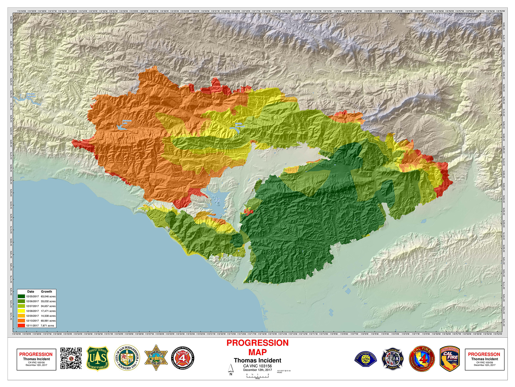
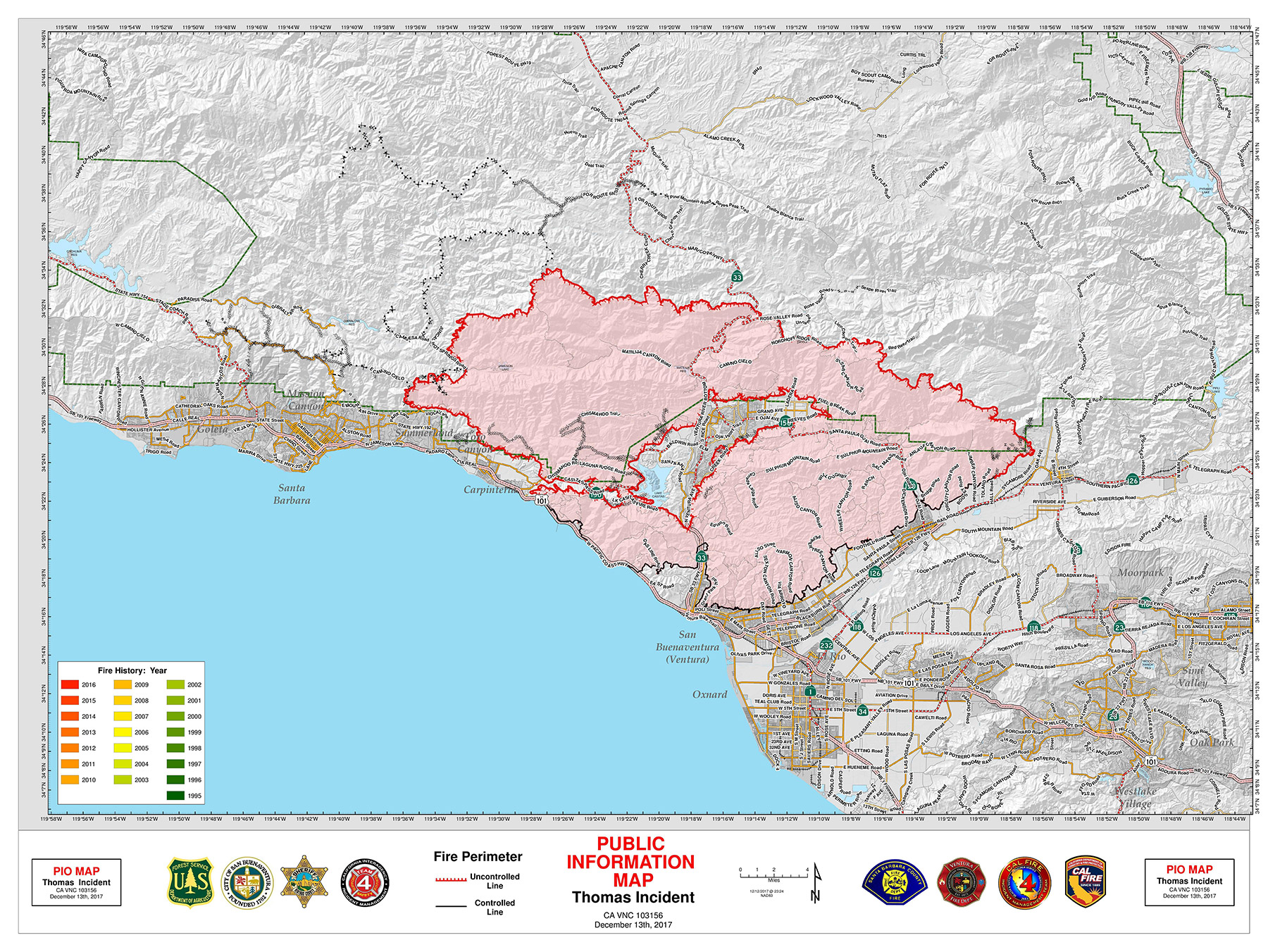
There are only a few maps to be trusted for this fire — and the next. The first is a perimeter survey conducted every night by a Boise-based, infrared-equipped plane contracted by Cal Fire, the state’s firefighting agency. The resulting “Public Information Map,” which shows in topographical detail where contained and uncontained lines are located, is distributed to fire chiefs at their early morning briefing and posted on a government server. A few copies are posted in public spaces. The map is not, however, widely distributed or made easily available online for reasons unclear. News organizations can request copies, which Santa Barbara media regularly does, or internet users can visit the federally operated website inciweb.nwcg.gov and search themselves.
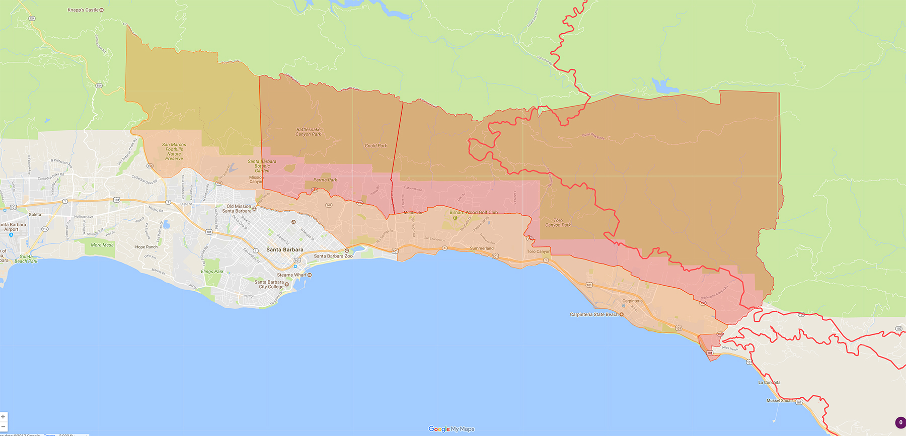
The second reliable map is being posted by the County of Santa Barbara at countyofsb.org/thomasfire.sbc#update. It’s a searchable Google map — now viewed more than 2.4 million times — that outlines the fire’s edges using the Cal Fire survey and overlays the voluntary and mandatory evacuation zones. Users can plug in their address to see whether they live in either of these danger areas. A similar map, but with more detailed evacuation zones, was developed by S.B. City Fire Chief Pat McElroy and can be seen at independent.com/firemap17. Ventura County published its own helpful map at readyventuracounty.org.
But when a wildfire is expanding so rapidly, people want maps that are updated more than once a day. So “hotspot” maps that utilize NASA satellite imagery and pinpoint flames with yellow, orange, and red circles and squares were shared far and wide by worried citizens. Unfortunately, more often than not, the maps fanned unnecessary panic as the NASA data, processed and publically uploaded every few hours, can be tricky to decipher or just plain incorrect.
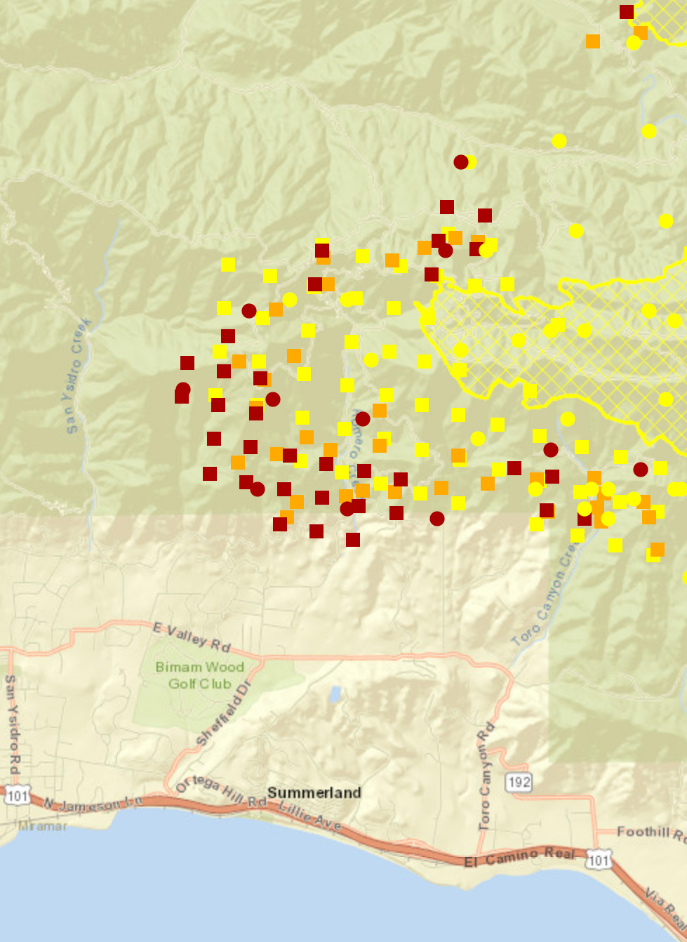
During the second week of the fire, red squares briefly blanketed Carpinteria, as if the city’s entire downtown had been leveled, and yellow circles soon popped up behind the Riviera, implying that spot fires were invading the city. These “hotspots” were likely warm, dense plumes of smoke or other “false positive” hits. Fire officials advised the public to stop re-sharing these maps.
At least two nongovernmental maps created this week by area journalists and programmers are worth viewing. Ventura County Star producer Matt Saint, assisted by area residents Rick Ray and Keith Cody, is methodically plotting the location of each home lost in Ventura through reader reports and their own visual confirmations. The resulting sea of pinpoints, some of which cover entire foothill neighborhoods, is sobering. And Direct Relief’s research and analytics team also put together a real-time, multilayered map of unfolding Thomas Fire locations and conditions. It’s found at directrelief.org.