
Despite COVID-19 cases flaring up across the country, Santa Barbara County has managed to stay stable overall the past few weeks — all of which can now be tracked by the public on the county’s newly released pandemic Community Data Dashboard.
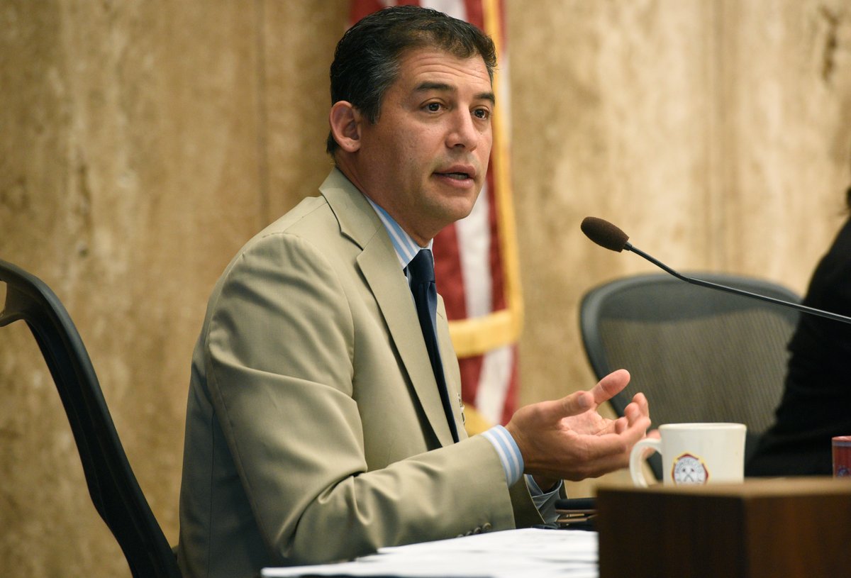
“There’s obviously something going on nationwide and internationally,” 1st District Supervisor Das Williams said about the increase in cases. “But I also want to put this in some context locally, because sometimes the number of new cases isn’t a very good metric compared with looking in the summer or spring when we had much less testing resources.”
And Williams is correct, making the new data dashboard even more critical.
Get the top stories in your inbox by signing up for our daily newsletter, Indy Today.
“As an infectious disease physician, I cannot wait to have this dashboard as a ‘one stop shop’ where I will find all the latest data and information that I need to tell the story of what has happened, but also to help me predict and prepare for what may lie ahead,” said Dr. Lynn Fitzgibbons with Cottage at the Board of Supervisors meeting Tuesday.
The dashboard is the result of a collaborative public-private partnership facilitated by LegacyWorks Group with a wide variety of community organizations guided by a steering committee made up of public health experts and community leaders. Carl Palmer, with LegacyWorks, gave a presentation to the board Tuesday and highlighted the top functions in the dashboard.
“The dashboard was created with a long-term view in mind,” Palmer said. “It serves as a tool to actively engage the community in reducing the spread of COVID-19, while at the same time creating a shared platform where we can collectively monitor the evolving nature of the pandemic and its effects on our communities.”
The dashboard builds upon the current surveillance metrics, status reports, and dashboard provided by County Public Health officials. Some of the key highlights include details like a flu report tab that also tracks influenza outbreaks in the area, a community tab that tracks metrics like food distribution and homelessness services, and tabs that compare Santa Barbara County to other California counties, the nation, and the world.

To access the new data dashboard and explore all of its features, click here.
“I’m always surprised at how people are asking me for more data, and I’m scratching my head because I’m not a data nerd,” said 3rd District Supervisor Joan Hartmann. “This is now what they wanted, and I couldn’t even imagine what it was, so having it is amazing…. I think this is really pioneering, and I imagine a lot of other people will be looking at this model.”
Every day, the staff of the Santa Barbara Independent works hard to sort out truth from rumor and keep you informed of what’s happening across the entire Santa Barbara community. Now there’s a way to directly enable these efforts. Support the Independent by making a direct contribution or with a subscription to Indy+.


You must be logged in to post a comment.