What makes the difference between a fabulous garden and one that doesn’t really impress? There are many elements that could be out of whack; the wrong size plant for the site, bad materials or materials used badly, excessive and wrongful pruning—the list is nearly endless. One consideration that can cause discord is that of color. Every color in the rainbow looks lovely in a bag of confetti, but, tossed into the landscape, the effect is not as pleasing. Not everyone has benefited from an education that included color theory, but most of us can tell what looks good with what. Here are some basic rules and tips to use color successfully in garden design.
Sometime in elementary school, we got to hold a glass prism up to a beam of sunshine and see the rainbow of colors of which that seemingly colorless light was made. I think our teacher even talked a bit about which colors were next to which. It was in college that the art teacher introduced the color wheel. There are the three primary colors, and between them are the secondary colors, made up of the two adjacent ones. Red is flanked by orange (made by mixing with yellow) and purple (made by mixing with blue), etcetera, etcetera. The basic rule of combining colors was that the secondary, or complimentary, color that was directly opposite the primary color on the wheel was a good choice to juxtapose. That may work fine when designing plaid fabric and can be helpful in the garden, too; orange poppies do look stunning with blue sage, and hybridizers have managed to put butter yellow and royal purple together in the most charming of flowers, the pansy. But consider a few other ways to look at color.
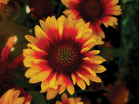
As an alternate and not quite so contrasting combination, use one of the adjacent colors. Plant blue dwarf plumbago (Ceratostigma plumbaginoides) with green Corsican hellebore (Helleborus argutifolius) for a cool look, or blue ground morning glory (Convolvulus sabatius) with purple allium to warm it up. Pair red petunia with purple coneflower (Echinacea purpureus) to tone down the red or with orange blanket flower (Gaillardia) to fire it up, and so on around the circuit. Of course, modern paint colors mine the infinite range of hues available between these pure colors and tint them with black for somber tones and white for pastel renderings, so take one of those complimentary colors and deconstruct it even more creatively.
Say you have a sage green fence; that particular shade of green, although muted, still contains some yellow and a touch of blue, so planting yellow-flowered Brugmansia cubensis ‘Charles Grimaldi’ next to Cape plumbago (Plumbago auriculata), with its pale blue-sky-hued flowers, could be the perfect foil. Use foliage colors, as well; the creamy yellow variegation of Phormium ‘Yellow Wave’ or the dusky blue of succulent Senecio mandraliscae will play well against that subtle backdrop. If you have a hard time visualizing such things, take a paint chip with you to the nursery, or get out the box of crayons and do some coloring on paper first. Make sure it is the giant box with 64 colors to play with.


