

I arrived at the Santa Barbara Museum of Art last Thursday eager to see Ray Strong: Beyond Santa Barbara, an intimate exhibition of six paintings and drawings by Ray Strong, and to observe Tina Villadolid, the museum’s coordinator of community art programs, as she conducted a public workshop on sketching in the gallery. I was just going to watch and take notes, but Villadolid had other ideas about my participation. “You have to draw — it’s the only way to understand this,” she said in a firm voice as she handed me a clipboard with some sheets of paper and a sketching pencil.
An hour later, holding my clumsy attempt at copying Ray Strong’s 1971 drawing “Field Near Assisi,” I felt as though I had been whisked through a portal into the inner sanctum of creation. If, as the great English writer Samuel Johnson once contended, the work of the critic is “improving opinion into knowledge,” then my drawing session in the gallery was a powerful reminder that to truly know something, one must do it.
The steps outlined for us were the opposite of paint-by-numbers instructions; rather, they were reliable ways of seeing and thinking using pencil and paper. To begin, Villadolid led by example, announcing that she likes to draw her own frame, rather than let the edges of the paper become the frame by default. Suddenly my first marks had a mission and a direct relation to every other mark I would make from then on. Nervous about drawing decently straight lines for the frame freehand, I soon discovered that the very irregularity of those initial lines would be among my most important tools. Asking us to start copying from the top down, and to draw lightly at first, our teacher said it’s “not about accuracy, but about capturing the quality of the line.”
This provoked the night’s first question, and it was a great one. “What do you mean by ‘quality’?” a student asked, and Villadolid lit up with enthusiasm for the opportunity to answer her. “The quality of a line refers to all the ways that it can be — dark or light, curvy or straight, continuous or intermittent, jagged or smooth, undulating or erratic,” she said, adding that “quality of line is what lends emotion to an image.” And just like that, my copy of Ray Strong’s “Field Near Assisi” was off and running, as I strove to capture the quality of his lines.
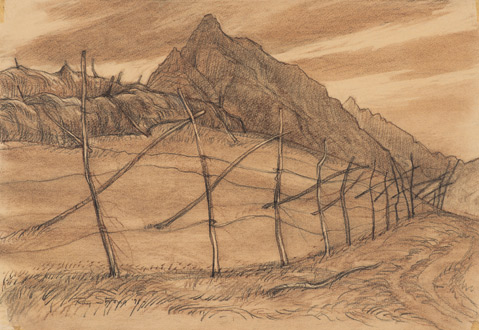
“Field Near Assisi,” sketched en plein air with a graphite pencil and a Conté crayon, features a simple rustic fence made of poles lashed crosswise against the backdrop of a mountainous skyline. The irregular “x” shapes of the fence march diagonally into the distance on the right, drawing the viewer into the image. As I chipped away at copying this picture, adding lines here and there while paying close attention to their qualities, I mentally embraced Villadolid’s habit of using the verb “to love” interchangeably with “to notice” — as in “I love the way this rustic fence frames the fields and mountains behind it.”
Following the steps of a dance begun by Ray Strong’s pencil some 44 years ago in Italy, I rediscovered the intricacy with which he translated vision into image. As I savored each detail of Strong’s composition, I thought of something art historian Ernst Gombrich once wrote about another, quite different, picture made in Italy, Leonardo’s “The Last Supper”: “There is so much order in this variety, and so much variety in this order, that one can never quite exhaust the harmonious interplay of movement and answering movement.”


