

Each fall, paint companies and interior design experts select their choices for Color of the Year, and these selections become a prediction of the colors that will influence home décor trends in the coming year. As someone who loves design and color, I eagerly await these announcements. More than just looking at pretty colors, I try to determine what these colors have in common. And more so, what do these colors say about today … and tomorrow?
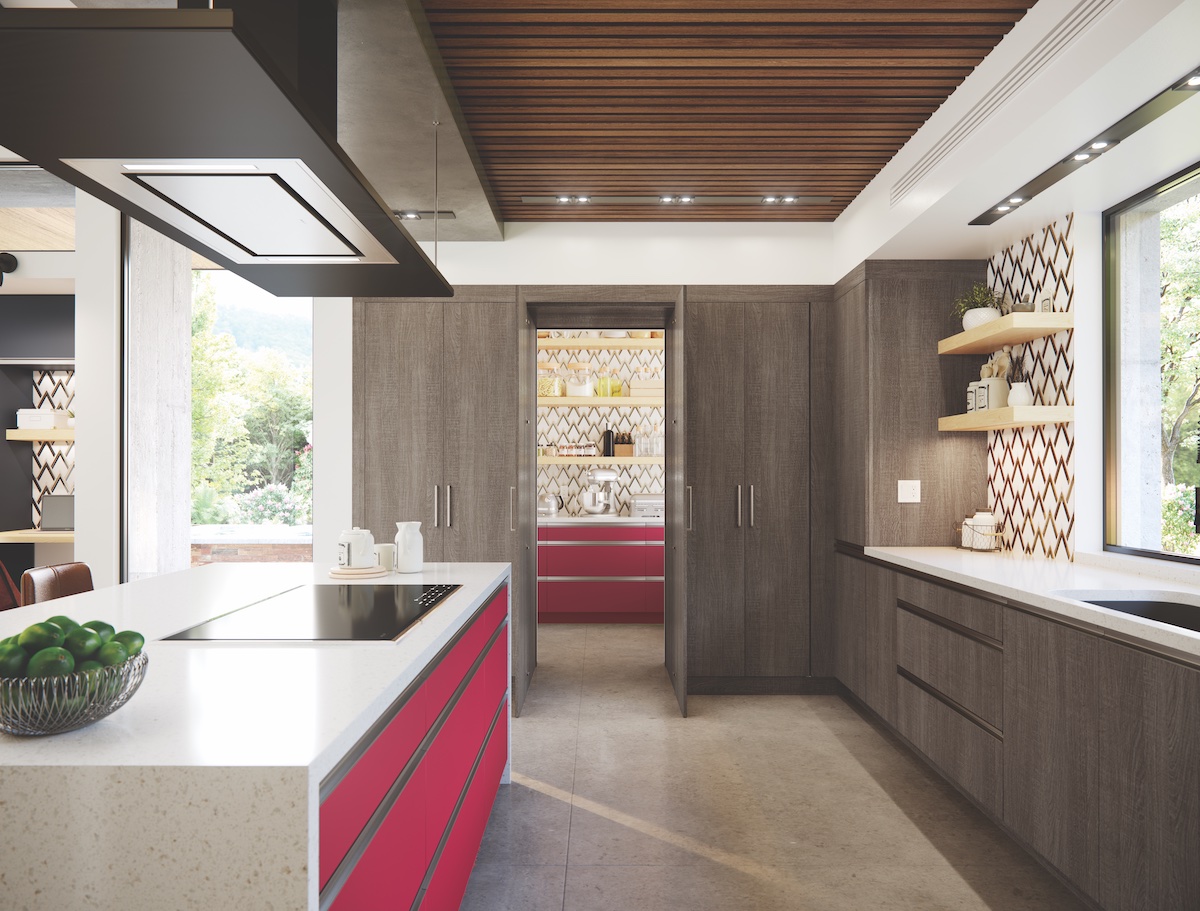
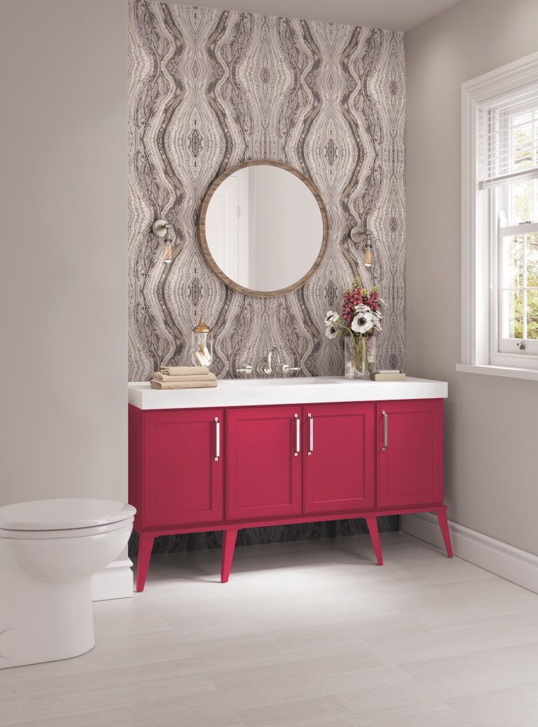
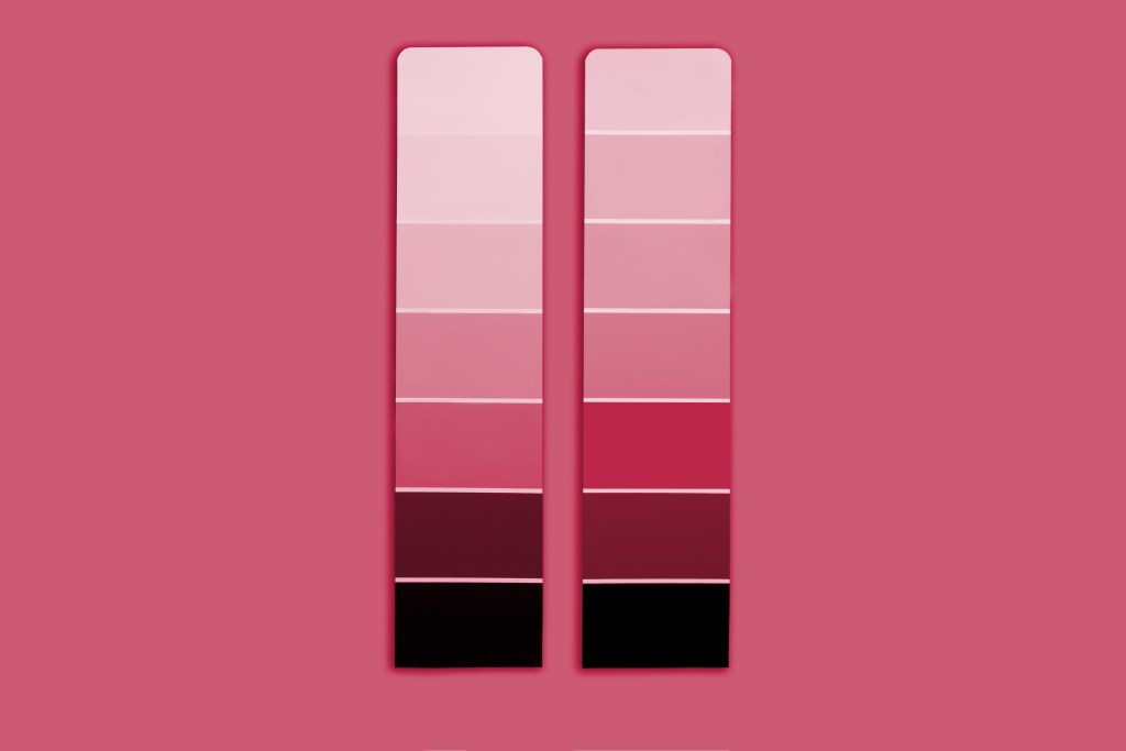
While the selections for 2022 centered around earthy shades of green, 2023 is all about bold, rich colors, most of them in varying shades of pinkish-red. Think rosé, cranberries, and salsa!
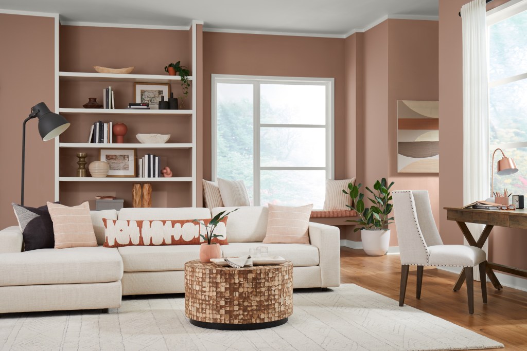
In late September, Sherwin-Williams selected Redend Point SW 9081, which, to me, felt like a natural continuation of the earthy tones so popular in current interior design trends. A blend of beige and blush, Redend Point has pink undertones, great for adding warmth to a room.
“People have been drawn to nature-inspired and earthy tones the past couple years, and this is something that will continue into 2023 and beyond,” says Sue Wadden, Director of Color Marketing at Sherwin-Williams. This soft shade may not be for everyone, but adding it to a powder room or nursery can make a welcoming statement.
Since Sherwin-Williams’ announcement, other major paint and design companies followed suit with picks in an array of blushes, plums, and reds for their choices for color of the year.
Pantone chose Viva Magenta 18-1750, a bold pinkish-red, calling it “an unconventional shade for an unconventional time.” The color is “inspired by the red of cochineal, one of the most precious dyes belonging to the natural dye family as well as one of the strongest and brightest the world has known,” said Leatrice Eiseman, Executive Director of the Pantone Color Institute.
Dunn-Edwards selected Terra Rosa, a rosy pink, while Benjamin Moore’s Raspberry Blush is a cheery, vibrant hue that pairs beautifully with blues. Better Homes & Gardens selected Canyon Ridge, a light pinkish-clay color that makes me want to visit the plains of the southwest.
“People are ready to bring color back into the home, taking a step outside their color comfort zones,” said Andrea Magno, Color Marketing and Development Director at Benjamin Moore, in a press release.
Perhaps my favorite selection is Graham & Brown’s Color of the Year 2023, Alizarin, self-described as “deep and moody yet refreshingly warm, this auburn red shade is made for creating inviting spaces. Named after the pigment derived from the Rubia plant species historically used as dye throughout the world, this rich red will take you on a journey to ancient and exotic lands.”
What inspired so many companies to pick a pinkish red for 2023? I’m guessing it has something to do with the fact that red is associated with courage, passion, heat, and love, and in today’s world, I’ll take an extra dose of sweet, spice, and everything nice! Happy New Year!
Christine S. Cowles is owner of Styled & Staged Santa Barbara, an interior design company specializing in short-term rental properties. She is a certified Short-Term Rental Stylist™, member of Santa Barbara Association of Realtors and Real Estate Staging Association, and a proud WEV graduate. She can be reached at info@styledandstagedsb.com.
Support the Santa Barbara Independent through a long-term or a single contribution.


You must be logged in to post a comment.