For decades, the unwritten rule of residential paint was simple: Vary the wall color, and always use bright white paint for trim, doors, and ceilings. Interestingly enough, the popularity of white trim and ceilings dates back (at least to my findings) to the late 1800s as dark, heavily draped Victorian interiors (dare I say “color-drenched”?) gave way to an obsession with cleanliness.
White paint shows dust and soot easily, so clean, bright ceilings and trim signaled that a home was scrubbed and sanitary. With the use of coal fires and gas lighting, maintaining this cleanliness required constant attention, and this upkeep became a subtle signifier of wealth.
Fast-forward until recently, with this color scheme being the decades-long standard for most home interiors. But, sayonara white trim and ceilings … and hello, monochromatic rooms and spaces!
Color-drenching is the application of painting your walls, baseboards, window casings, doors, built-ins, and even the ceiling in the exact same hue. It’s become the darling in the design world of late, and with good reason. Here is why color-drenching works, when to use it, and the tips for getting it right.
Why Color-Drenching Works
When you paint your trim and ceiling to match your walls, you erase sharp visual boundaries. Your eye no longer stops at every doorframe, baseboard, or crown molding, which transforms how a room feels in several key ways:
- Softens Awkward Architectural Angles: If you have sloped ceilings, choppy dormers, or a room that opens into an asymmetrical layout, color-drenching smooths out those hard visual breaks, making the architecture feel intentional rather than awkward.
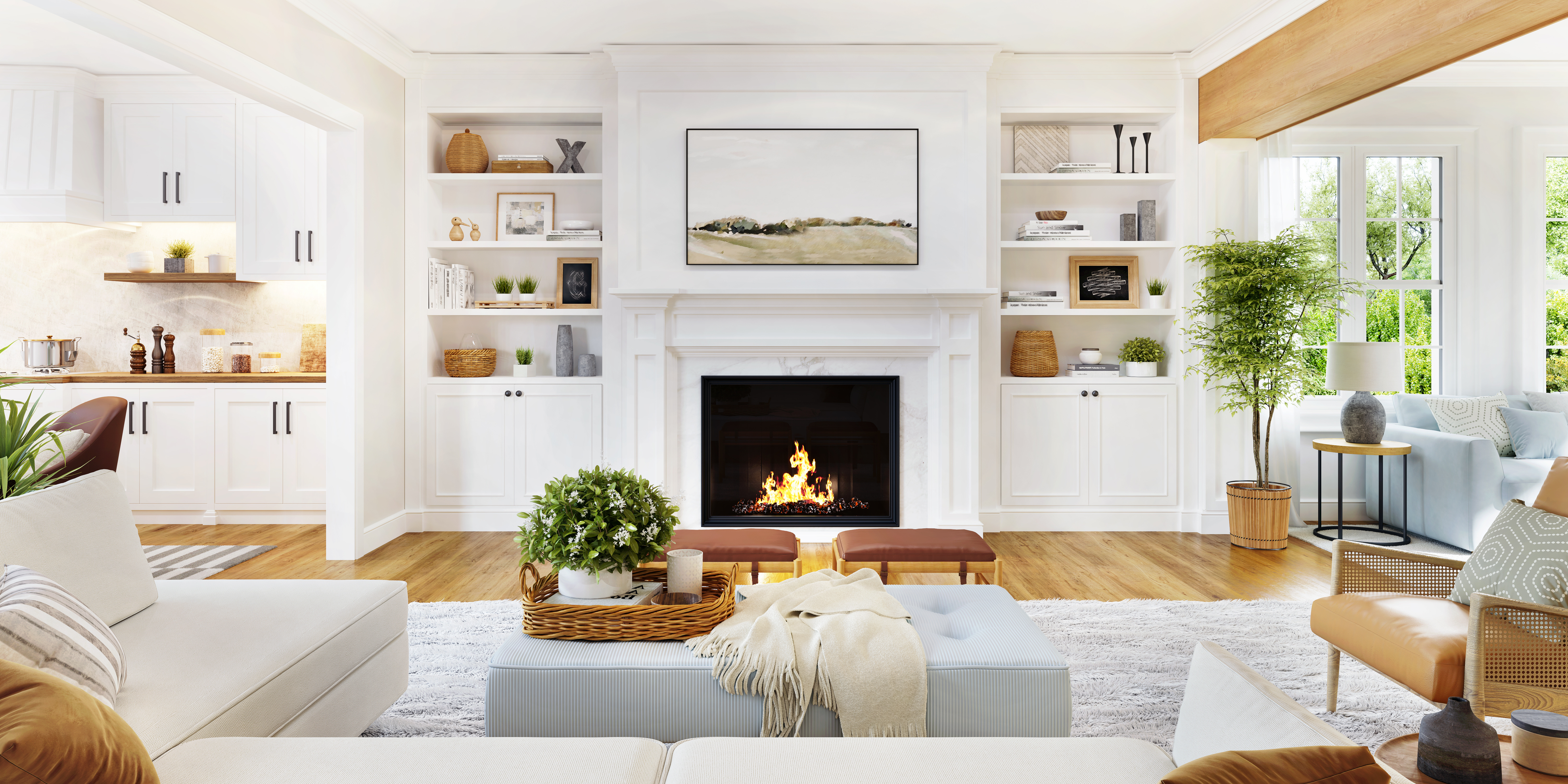
- Makes Built-ins and Carpentry Seamless: Painting bookcases and wall-to-wall cabinetry the exact same color as the walls allows your furniture and favorite books, artwork, and ceramic finds to truly pop.
- Expands Small Rooms: In smaller spaces or rooms with standard eight-foot ceilings, your eye sees a visual break when walls, ceilings, and trim are painted different colors. Using one color across every surface causes room boundaries to melt away, making smaller rooms feel instantly larger.
When to Keep Contrast
Color-drenching isn’t about hiding beautiful craftsmanship. If your home boasts original dark-wood trim, hand-carved molding, or sweeping window frames that frame a killer view of the Santa Ynez mountains, contrasting trim serves as a purposeful, artistic frame. If you choose to paint the trim in a different color, consider skipping the standard bright white and instead opt for soft, tonal contrasts.
Sheens, Lightening, and Transitions
If you are painting everything one color, how do you keep the room from feeling flat? The secret lies in sheen and subtle tonal shifts.
- Vary Your Sheens: Use an eggshell finish on the walls to absorb glare, and step up to a durable satin on the doors, baseboards, and built-ins. The slight shift in sheen catches light differently, giving wood trim a subtle, tactile dimension while providing crucial protection against daily scuffs.
- The 50 Percent Ceiling Trick: If you want a cohesive look but fear a dark ceiling might feel too heavy, ask the paint shop to mix your wall color at 50 percent strength for the ceiling. This maintains the exact same undertone while keeping the space feeling light and airy overhead.
- Master the Room Transition: Wondering how to paint doors between rooms with different colors? Paint the edge and inside face of the door to match the room it opens into, and paint the opposite side to match the adjoining hallway or room.
- Test Before You Commit: Before painting an entire room, order peel-and-stick paint samples. Move them around the room to observe how the color shifts under different lighting conditions and different times of the day.
Ditching the white trim default is one of the easiest, most high-impact updates you can make this season. By letting color envelop your space, you’ll create a custom, thoughtfully designed home that feels elevated, serene, and uniquely yours.
I’d love to see your color-drenched rooms! Tag me on social media @saltwood.interiors.
Christine S. Cowles is the owner of Saltwood Interiors, an interior design company specializing in residential and vacation rental properties. She is a certified Short-Term Rental StylistTM, member of Santa Barbara Association of Realtors, and a proud WEV graduate. She can be reached at design@saltwoodinteriors.com.