

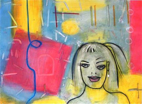
In his current show of paintings at frameworks, Erik Reel explores the depths of the human experience. The artist was inspired by the expressions on the faces of people stripped of material possessions, and something of that spiritual intensity comes through in his work. “Like soldiers coming back from war,” Reel said, “or people who’ve experienced immense loss, there is a gauntness there, a waning, a sense of other-worldliness.”
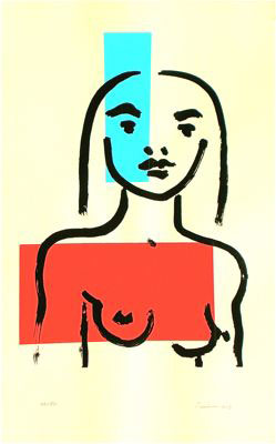
Reel explains that the recurring images of faces, many of which seem to resemble women, are not meant to be male or female, but simply to conjure a presence. “I see them as archetypes for people to see within themselves – a reflection of everyone’s male and female component – that place that exists inside everybody,” Reel explained.
At first glance, Reel’s paintings and prints may seem simple or even elementary, but on closer inspection, his craft shines through. In these paintings, Reel uses interference colors, which break up the light such that parts of the image appear on different levels. This distortion is subtle yet effective, unsettling the viewer and evoking emotional responses.
In a recent gallery walk-through with the painter, I asked him to identify his primary artistic goal. Reel said he hoped “for the viewer to sink down into themselves in a really deep way, experiencing a level of ruthlessness without having to experience immense loss. It’s about getting down to the truth: no illusions, no wishy washy buffers. The more that we could be woken up in that direction, the more conscious we could really become, and that’s true political art.”
Reel knew he was an artist at nine years old. “I was always drawing, and from the very beginning I mixed drawing and painting media,” he said, a habit that remains central to his work today. While Reel considers painting his main medium, he also produces original silkscreen prints or serigraphs. Printmaking has fallen out of popularity over the years as traditional serigraph inks easily mar and scratch, making for a quickly corroding final product with a shorter life span than a painting. The inks Reel uses are exceptionally permanent and dry to a hard, film-like surface, avoiding the traditional problems. These inks have also been developed so that a high degree of translucency is possible, letting light penetrate into the ink layer, thus avoiding the flat, dull look of traditional serigraph inks, creating a rich color and depth comparable to acrylic and oil paintings.

“I use a lot of medium and very little pigment so the light goes through pigment and bounces around,” Reel explained. I want as much depth to the color as possible.”
Reel discovered this technique with Santa Barbara screen printer Earl Arnold of TableSalt Press. The pair succeeded in creating an exciting series of images that quickly gained national recognition. Their first edition made it into the prestigious Society of American Graphic Artists (SAGA) annual New York City show in 2004, the first time in its 76-year history anyone from the Central Coast of California had done so. Despite his international recognition, Reel prefers to paint in his studio in Ventura, his home base since 2006. Reel has shown his work in museums and galleries throughout the world and has had more than 11 solo shows in Santa Barbara, including multiple shows at the Contemporary Arts Forum, Karpeles Museum, Delphine Gallery, and Roy.


